

Mentor Buddies, created by Design Buddies, is an app that allows those who are just entering the field of UX design to engage in one-on-one chats with design experts in exchange for a small donation to a charity of the mentor's choice.
Roles
UX Researcher, UI/UX Designer, UX Strategist
Tools
Figma, Mural
Time
~1 month
About the Client
Design Buddies is an inclusive Discord community of more than 50,000 designers. Design Buddies' mission is to support those who are new to the field of UX Design by providing virtual spaces, chats, and events to anyone who wants to join. However, there's a growing demand from members who want to speak directly to experts 'on-demand' in order to get specific answers to their questions.
That's where Mentor Buddies comes in.
After a privately released beta test, it became clear that changes to the onboarding experience were vital. But first, I needed to further understand what the problems were.
Stakeholder Interview

We interviewed the founder of Design Buddies, Grace Ling, to further understand the current problems with Mentor Buddies.
This interview helped me further my understanding of business goals in order to design a solution that meets both user and business needs, gather important information about the current Mentor Buddies app, what was working and what was not working, and understand the constraints and challenges of the project.
Business Goals
Get new users all the way through the onboarding flow, to the point of starting their first session.
Instill confidence in users to help them gain knowledge about UX Design.
Increase revenue and grow user base.
What’s Working?
Those who do end up meeting with mentors are extremely satisfied with their sessions and walk away feeling like a better designer.
Users who complete their first session keep coming back to the app.
The app furthers Design Buddies overall mission of supporting those who are new to UX Design.
What’s Not Working?
Very high drop off rates during the onboarding process.
Most users never make it to their first session with a mentor.
Constraints & Challenges
Must be designed as a mobile app.
Redesign needs to focus on the onboarding flow.
Users must complete sign up, verify phone number, and donate prior to starting a mentor session.
Analytics
Analytics from the beta test helped to identify patterns and trends of users in order to help determine which areas needed the most attention in the app. High drop off rates were already known, but where were these drop offs happening?
Three screens stood out that clearly needed to be focused on.
Create Profile
The Create Profile screen stood out immediately. This screen has a high drop off rate (66%) and it’s extremely early in the onboarding process (second screen).

Mentor List
The Mentor List screen was the next one to stand out. Users spent a lot of time on this page (nearly 6 minutes on average), with another drop off rate of 66%, and there were very few clicks on the search bar as documented with the heat map.

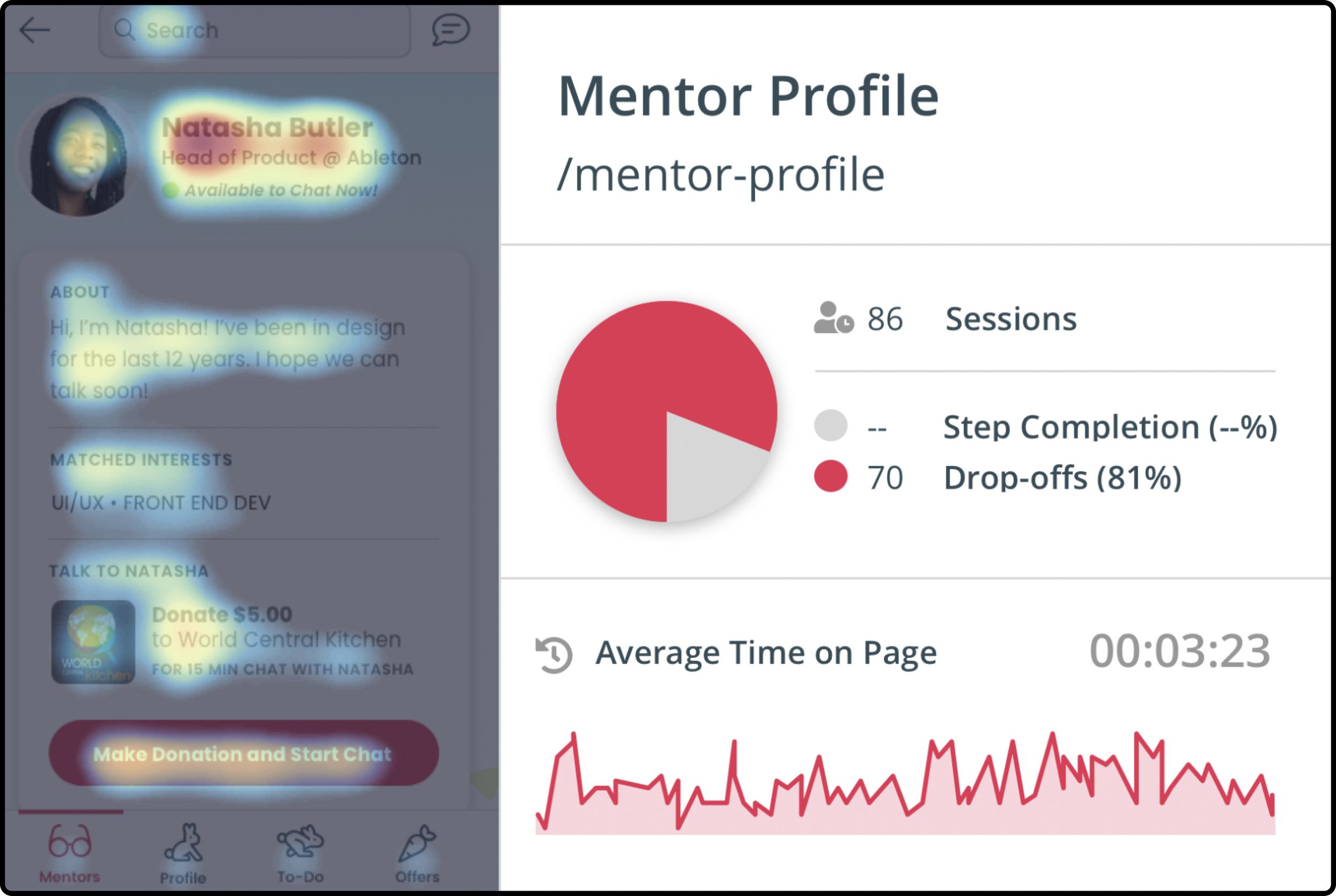
Mentor Profile
The final screen that really caught my attention was the Mentor Profile screen. This screen had the highest drop off rate (81%) and the majority of clicks were centered around the mentors' name rather than the CTA button to start a mentor chat.
Usability Testing
After identifying the main points of friction in Mentor Buddies, it was time to uncover the 'why'. I needed to understand why such high drop off rates were occurring in order to create a solution.
By synthesizing the responses from usability testing and creating affinity diagrams, four main themes were discovered.
Themes 1 & 2
After identifying the main points of friction in Mentor Buddies, it was time to uncover the 'why'. I needed to understand why such high drop off rates were occurring in order to create a solution.
By synthesizing the responses from usability testing and creating affinity diagrams, four main themes were discovered.
“I wish there was more personalization so I know I’m being matched properly.”
“I wish I could explore the app before having to create a profile.”

Theme 3
If users reached the list of mentors, they were confused, frustrated, and overwhelmed by the inability to filter the results.
“I wish I could narrow down the list of mentors.”

Theme 4
Users who made it all the way to a mentor profile page still didn't feel confident about selecting that specific mentor because of a lack of information about the mentor.
“How am I supposed to figure out if this is the best mentor for my questions?”
Once I felt that I understood both the business and user goals, I was able to begin redesigning the Mentor Buddies app with a solution that accomplishes both sets of goals.
Design Buddies wants more users to make it through onboarding and start a mentor session.
Our users want to feel more confident in the app and have more control of their experience.
Creating a Welcoming Onboarding Experience
The onboarding process for Mentor Buddies needed to accomplish two vital things:
Users needed to feel that the app was asking them enough questions for it to reliably match them with mentors that could help them.
Users needed to be able to explore the app before being forced to sign up.
Designing a solution that marries both user goals and business goals was essential. The more users that get through onboarding, the more users that will start mentor chats.
Before:
After:
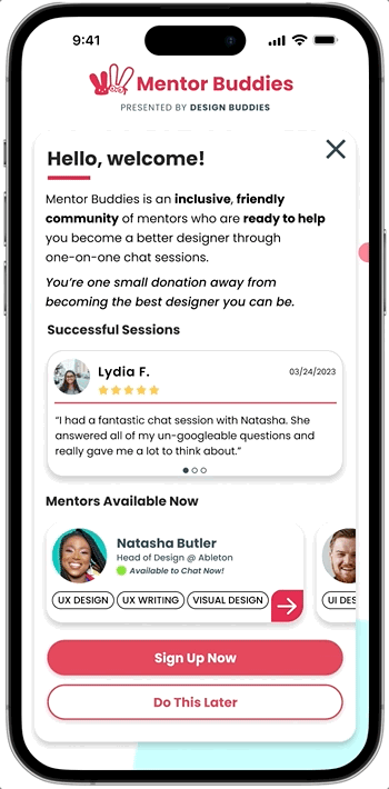
In order to give the user more control of their experience, I adjusted the onboarding user flow. The biggest change was the addition of a 'do this later' button to every screen of the initial sign up flow. While users would still need to complete this before chatting with a mentor, it gives them the option to explore the app before committing to account creation.
I updated the information on this page so that new users now get a clearer picture of what Mentor Buddies can offer them from the moment they open the app, with mentee reviews and mentor profiles showcased. I moved topic selection to a later screen so that this landing page could be entirely dedicated to pitching the app to new users.
Before:
After:

Minor updates were made to the create profile screen. Users now have more options for sign up with integrations from Facebook, Google, and Apple. If they choose to sign up manually, they input their phone number on this screen and the next screen is where they verify the code that was sent to them. These two additions help to lessen the speed bumps users are facing during onboarding and make the process faster.

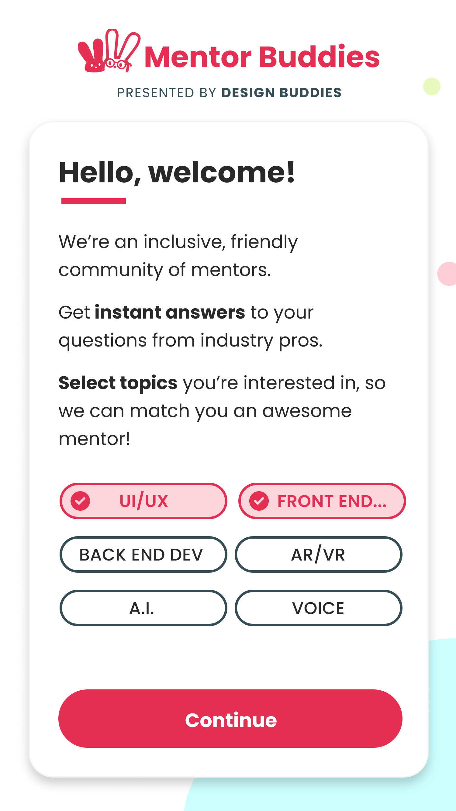
Users now select topics right after they create their profile. Again, minor changes here. I updated the language for available topics to select, they were extremely broad in the initial app design and didn't give users much control. Now, they're specific, and there's a search function if the suggested topics aren't quite what the user is looking for.
Before:
After:

Many updates were made to the mentor list page. First, a matching feature was added to give users a better idea of how well matched a mentor was to them. Then, I took out the selected charity from each mentor card. Since users weren't seeking this app out because they wanted to donate to charity, it felt unnecessary. Users want to first know more about the mentors, not which charity will be getting their money. Chips were also added to show areas of expertise and interests for each mentor.
Perhaps most importantly, filter tools were added to the top of this list, so that users can easily refine results with specifications of what they're looking for.
Before:
After:
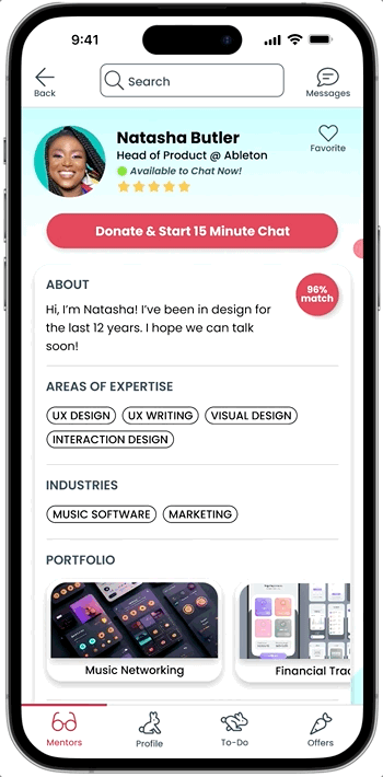
The mentor profile page was the page that most of my time had to be focused on. With the highest drop off rates and the most amount of time spent on this page out of all screens, it was obvious that this page needed heavy attention.
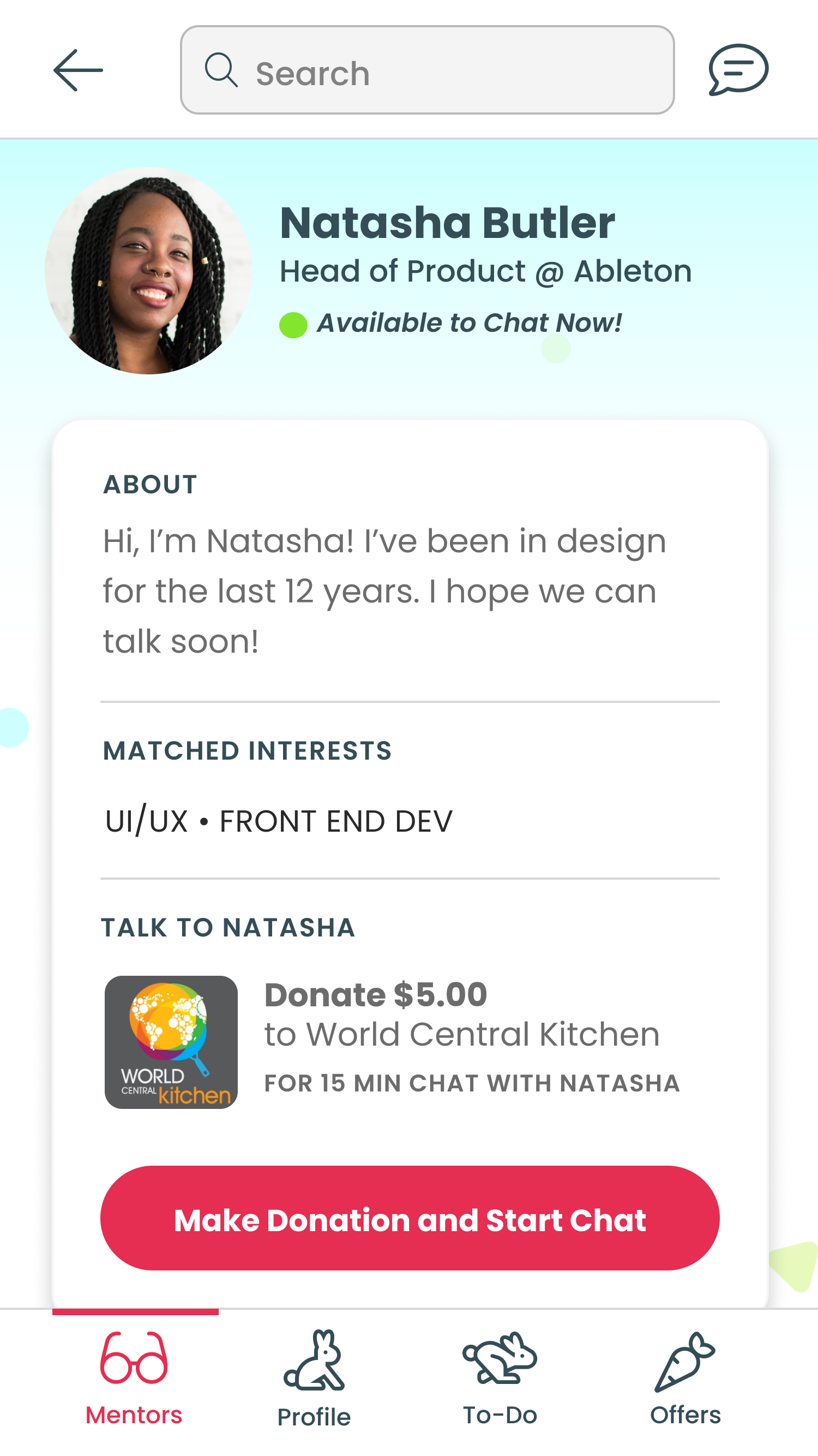
To start, I added a reviews feature so that users can see how well a specific mentor is rated. I also added a feature so that users can save mentors to their favorites. Mentor bios stayed the same, with additional information added below so that users can quickly see what areas of expertise mentors have and which industries they work in. I changed the wording from 'matched interest' to 'areas of expertise'. Since users weren't feeling trust that a specific mentor would be right for them, language that elevates the mentor can further instill trust in mentors from users.
A portfolio section was also added, so that users can see what mentors have worked on and get an idea if they are someone they'd like to speak with.
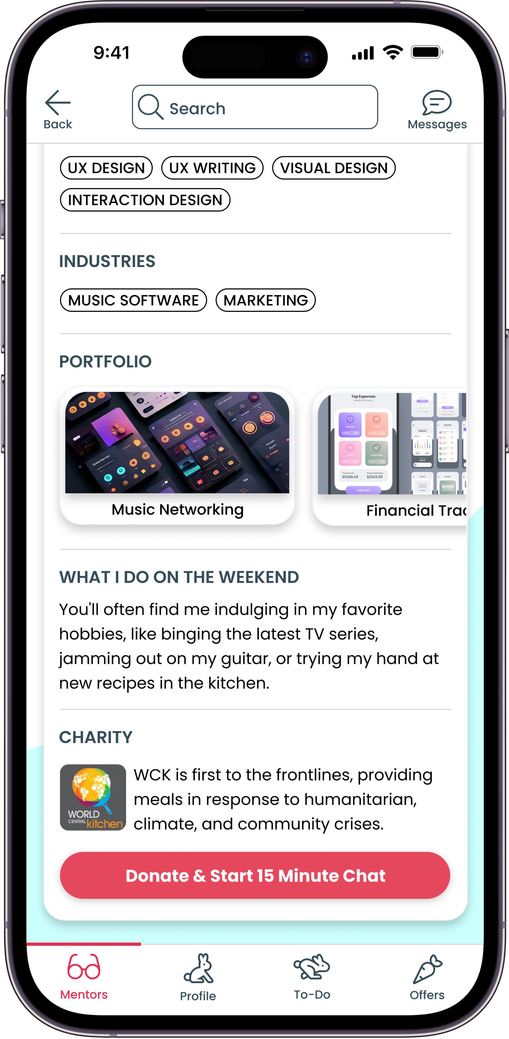
Further down the mentor profile page, a 'what I do on the weekend' section was added. This can help users get to know mentors on a personal level, something many users expressed a desire for during usability testing. The charity information has been moved down here, as well as another CTA button for users to start the mentor chat.

Finally, I added an NPS screen that shows up right after a user completes their first session. Since Design Buddies core mission is to help users, it's important for them to constantly be measuring how well they are accomplishing that goal.
Measures of Success & Next Steps
In order to measure whether this solution is accomplishing both user and business goals, the best KPIs to track would be:
The percent of users who make it to their first chat session
The percent of users who click 'sign up' button as opposed to 'do this later' button
With this iteration of Mentor Buddies complete, next steps would be to conduct further usability studies and continue tracking analytics to determine if this solution is meeting both business and user goals. Specifically, I’d like to test the before and after of the onboarding flow and then provide participants with a survey that asks them to rank how confident they were in the mentor they chose on a scale of 1-10. I could then compare those responses to see what areas are still in need of improvement in the redesigned onboarding flow.