

AlbumPulse is an all-in-one app for musicians to understand how their albums are performing, focusing in on album sales, reviews, and listener demographics.
Roles
UX Researcher, UI/UX Designer, UX Strategist
Tools
Figma, Miro, Maze
Time
~ 3 months
Research
I developed AlbumPulse while taking the Google UX Design certificate program through Coursera. AlbumPulse was designed to meet the needs of its users: to reliably track album sales.
Through user interviews, I discovered that many musicians had frustrations relating to how they were tracking album performance. Users had trouble understanding large chunks of data, were frustrated by having to access information from multiple different sources, and wished they had a better way to keep track of offline album sales. Users didn't feel as if they would get a full picture of their album's overall performance without these features.

“I wish I had a better way to keep track of album sales that happen in person, I sell a lot at shows.”

“I try to stay on top of tracking album sales, but the data is hard for me to process.”
These interviews revealed that there are a lot of things that are important to musicians in addition to album sales. Through understanding these user pain points, AlbumPulse was refocused to give users access to reviews, listener demographics, and the ability to manually input offline sales, in addition to album sales. Three key insights were developed surrounding user pain points.
Pain Point #1
Users don't have the time to access album data from multiple different sources.
Pain Point #2
Many users have trouble understanding data that isn't visually represented.
Pain Point #3
Users want to see all of their album data together, regardless of which band released the album.
These pain points were representative of two different groups of people. Those who were in bands as a passion project and those work full-time in the music industry. I delved deeper into these two different types of users via journey maps and, after I felt I had a full understanding, created personas to represent each of them.


After creating these personas, I created a problem statement to guide my design process and ensure that I was creating a user-centered design, not something that wouldn't be helpful in the real world.
Sean is an aspiring musician who needs a faster, more understandable way to track his album sales because contacting his label takes up too much time and he has trouble understanding all of the data.
I began conducting a competitive audit... only to discover that there weren't any direct competitors for what I was designing. This initiated a brainstorming process of what products were similar enough to my own that conducting an audit on them would be valuable. I chose to audit three music based products. A recommendation focused app, a review focused app, and a news focused website.
By identifying what features these products offered and the way they were presented, I was able to decide what features were necessary for AlbumPulse.
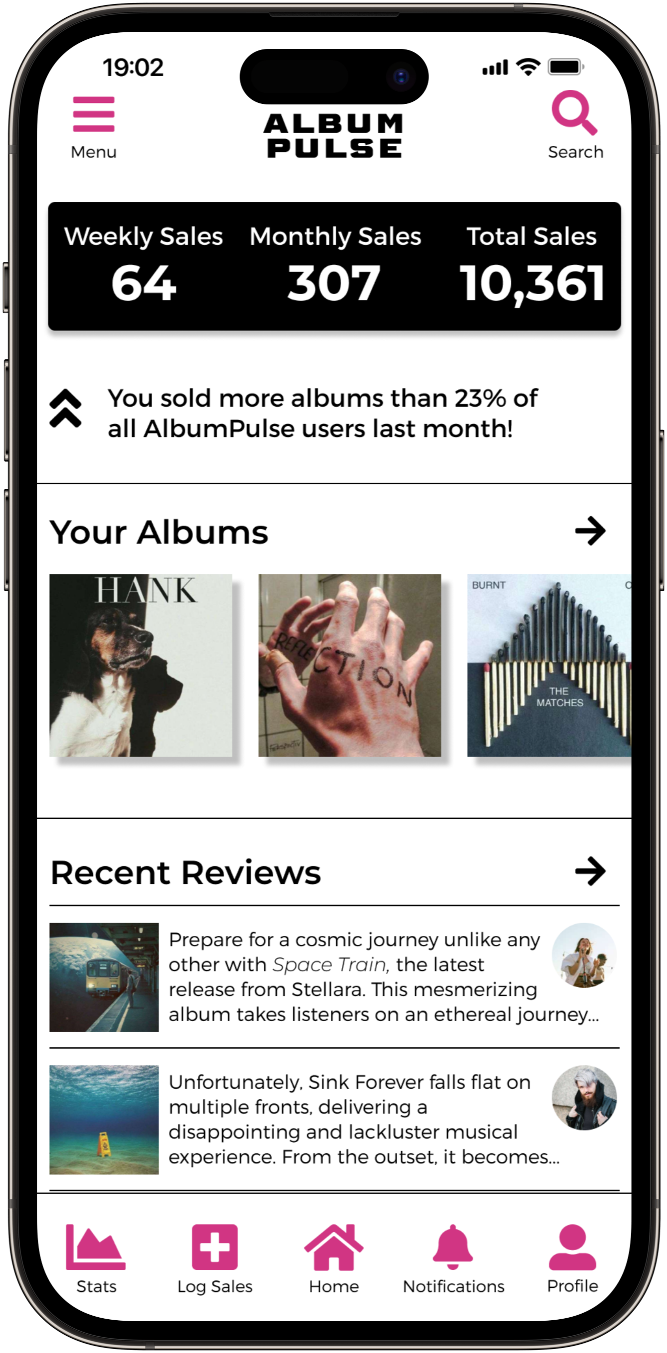
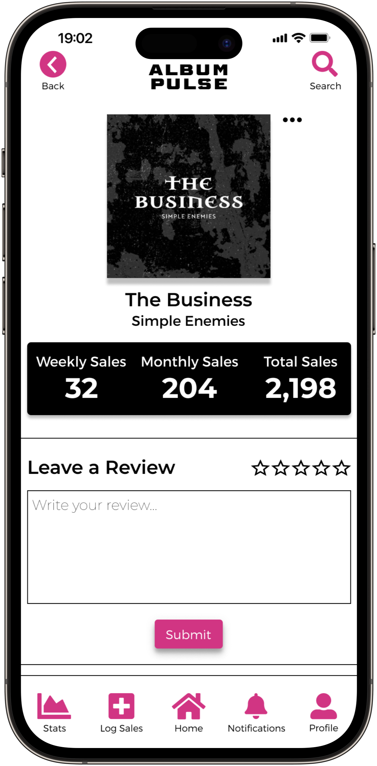
Album sales data
Allowing users to review albums
Listener demographics
Manual input of offline album sales
After this, I was able to start sketching my paper wireframes.
Development
I focused on getting all of my ideas down on paper, rather than judging them as they came.

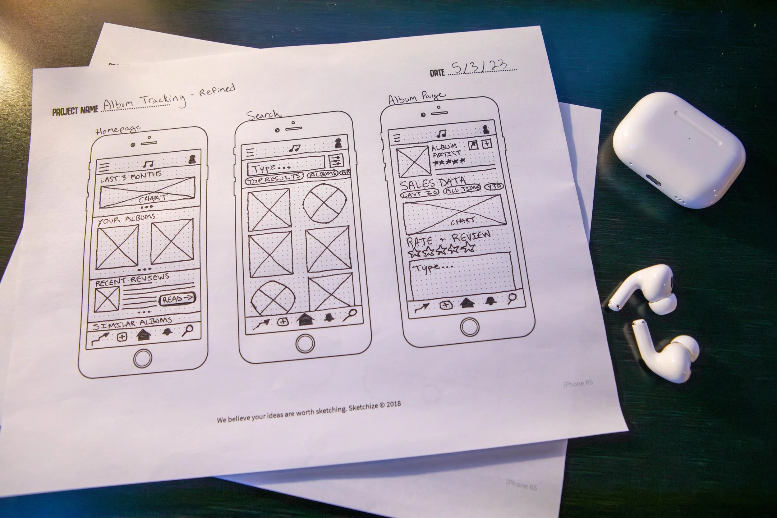
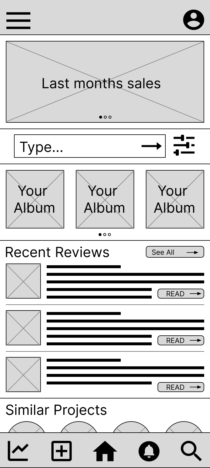
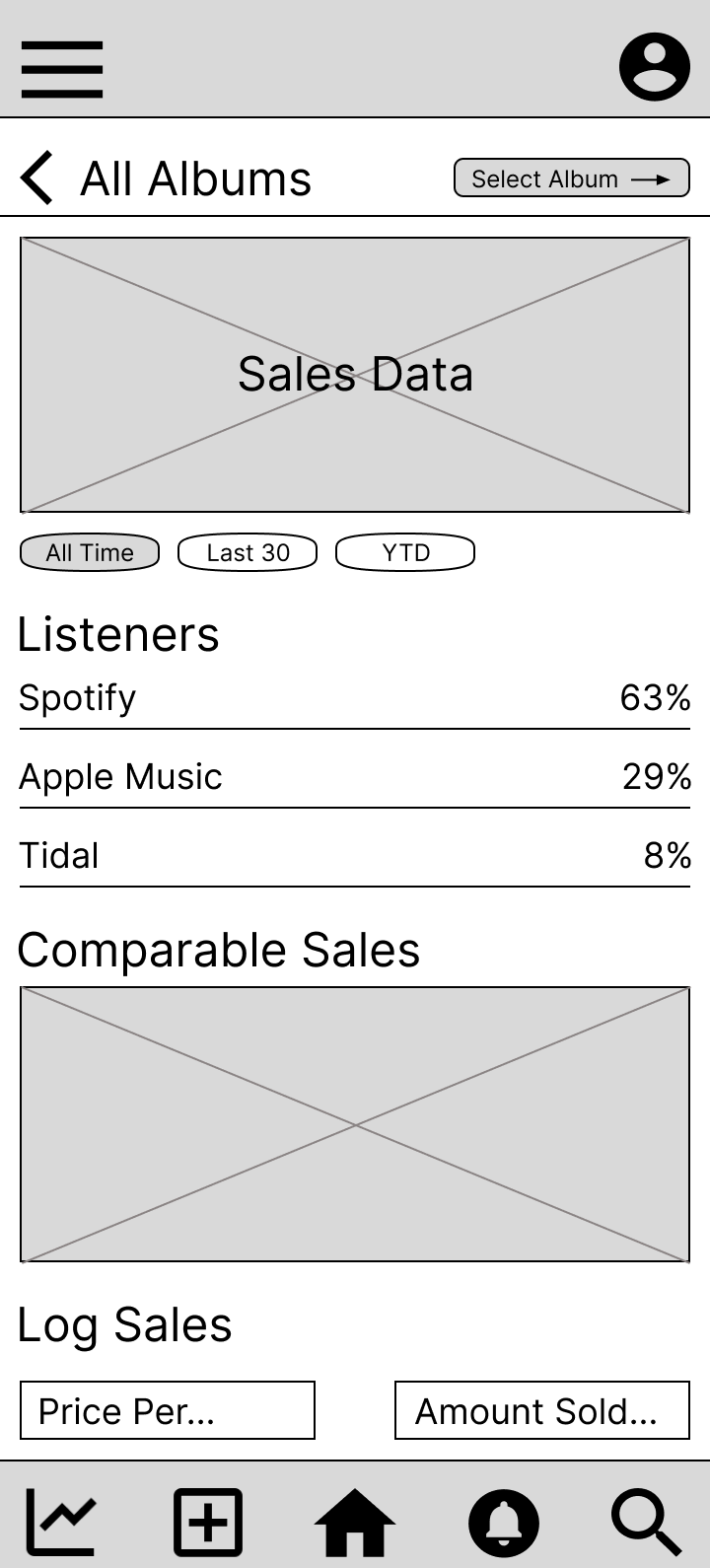
After, I was able to refine my wireframes.
Then, I was able to bring them into Figma as digital wireframes.
Usability Testing
With my low-fidelity prototype ready, I began recruiting participants for an unmoderated usability study. Using Maze, I had five participants test the primary user flow within the app: to search for and add an album to their profile.
Using an affinity diagram, I developed key insights that were necessary to iterate on:
Users needed better visual cues for how to access the search function
Users needed a more intuitive way to navigate to other users profiles
With important insights now revealed, developing the next iteration of mockups could begin, focusing on the search function, which was defined as my priority 0 insight.
Before:

After:
Many changes were made in the transition from low-fidelity prototypes to mockups. All of them moving towards improving the overall user experience and keeping users on the happy path.
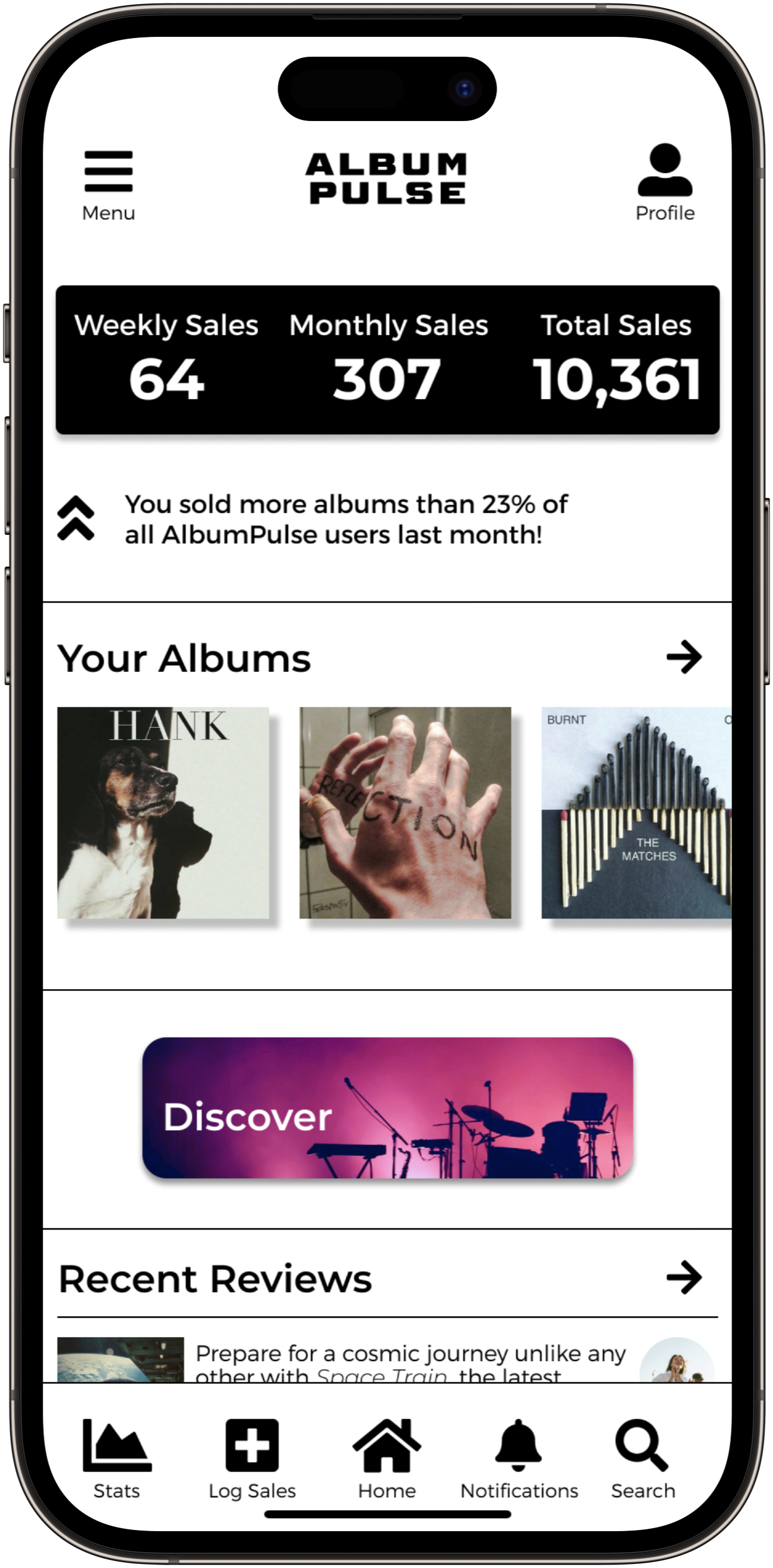
In order to specifically address the P0 insight, I added labels to each icon for better accessibility and also placed a 'discover' button on the homepage, giving users two ways to access the search function.
After creating the mockups, I conducted another usability study, with five participants, all unmoderated. This study revealed that there were still issues with the search function, as well as issues with buttons not being recognizable as buttons. I iterated based on this feedback.
Before:
After:
I got rid of the 'discover' button entirely, and moved the search icon up to where all participants expected it to be, the top navigation.
I also gave all of my buttons a uniform style and made important icons the same color as buttons, #D13583, in order to grab users attention.
Branding
AlbumPulse needed to feel energetic and passionate, to align with users goals of selling their albums and making it in the music industry. Users were coming from a place of frustration and hopelessness, and I wanted to give them a space that feels fun and engaging to enter, even if the data isn't where they'd like it to be yet.
I chose a bright pink and blue as colors for AlbumPulse in order to represent this energetic feeling.
I chose typography entirely from the Montserrat family in order to increase legibility for an app in which data can be overwhelming and hard to understand.
Hierarchy was created via variation of size, weight, and style.


Prototype
Wrapping Up
While there were a million things I could have kept iterating on with AlbumPulse, I felt that it was ready to make it's debut into the world. I'm happy with where it's at right now and, more importantly, users are happy with AlbumPulse.