
Helping an educator grow his reach through a clean, approachable coding labs platform.
My Role
Design Lead
Tools
Figma, FigJam, Zoom
Time
~1 week
Background
David Wolff — a full-stack engineer, skilled educator, and passionate developer community builder — needed a site to showcase his self-created coding labs in React, JavaScript, and CSS. These labs would be a resource for students he mentors and teaches, helping them build real-world skills through guided exercises. David approached me to help him turn his vision into a living platform — quickly and efficiently.
The Challenge
David needed a website that:
Highlighted his expertise and credibility.
Organized his growing collection of labs by topic.
Made it easy for students to explore and jump into coding.
Created a welcoming, polished experience — without feeling overwhelming.
Constraints & Requirements
No formal research or user testing due to tight timeline and budget.
Complete design cycle (wireframes → high-fidelity prototypes) within one week.
Quick Discovery
I conducted a rapid intake conversation with David to gather core insights:
Who are the target users? (Coding bootcamp students, self-taught developers)
What are their goals? (Find labs quickly, practice coding, trust the source)
What emotions should the site evoke? (Encouraging, motivating, clear)
Even without a full research phase, I built an initial user persona based on this discussion:

"The Aspiring Developer"
New to coding, eager to practice, craves straightforward resources without academic jargon.
With this user in mind, I began sketching wireframes focused on creating a clear, approachable path for exploring labs and diving into practice without unnecessary barriers.
Wireframes: Designing the Experience
I started with low-fidelity wireframes to map out user flows, making sure every step aligned with the needs of the "Aspiring Developer" persona: clear navigation, minimal cognitive load, and fast access to coding resources.
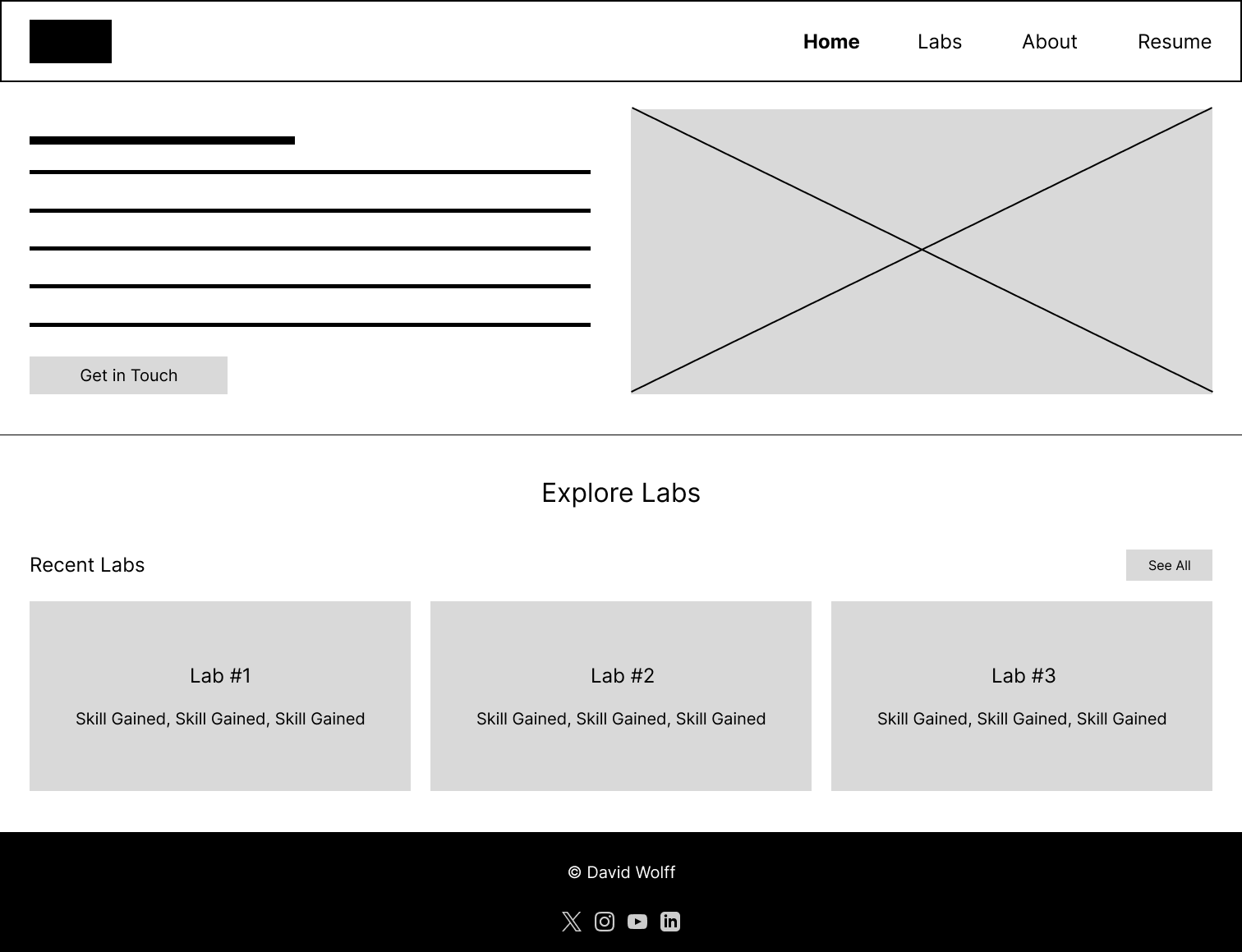
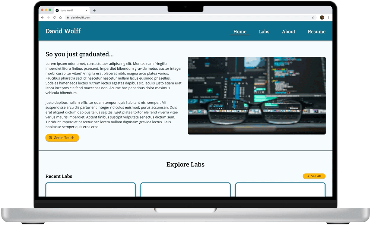
The Home page introduces the labs with a welcoming overview and clear entry points, allowing users to quickly start exploring exercises without unnecessary complexity.

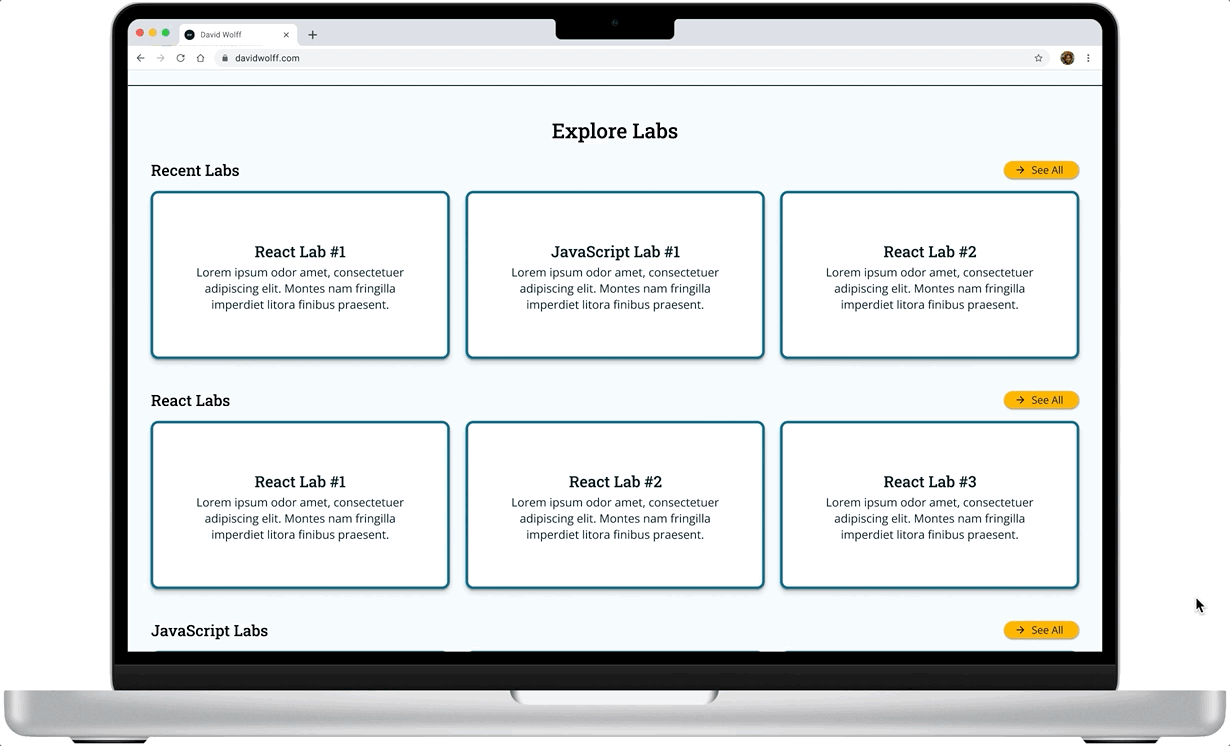
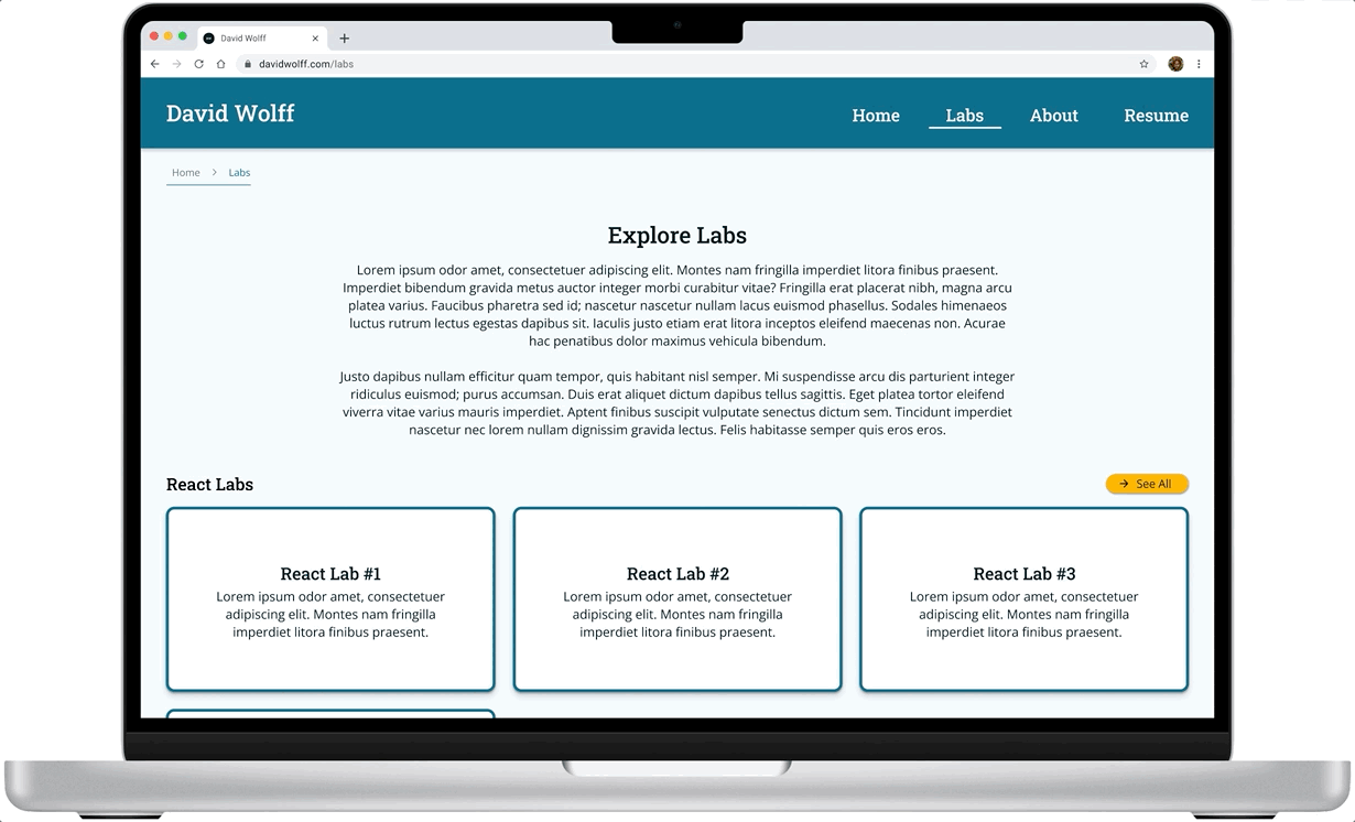
The Explore Labs page organizes coding labs by topic (React, JavaScript), giving users an easy, scannable way to browse skills and choose where to start.

The About page builds trust by introducing David’s professional background and teaching philosophy, helping students feel more confident in the resources while also providing a simple, accessible way for users to reach out — combining credibility and connection on one streamlined page.
These wireframes prioritized a clean structure to minimize overwhelm and help users feel oriented from the first click.
High-Fidelity Prototypes: Bringing It to Life
Once the user flows felt strong and intuitive, I transitioned into high-fidelity wireframes, refining the structure and layout while maintaining clarity and usability. The goal was to polish the structure while keeping navigation intuitive and action-oriented.
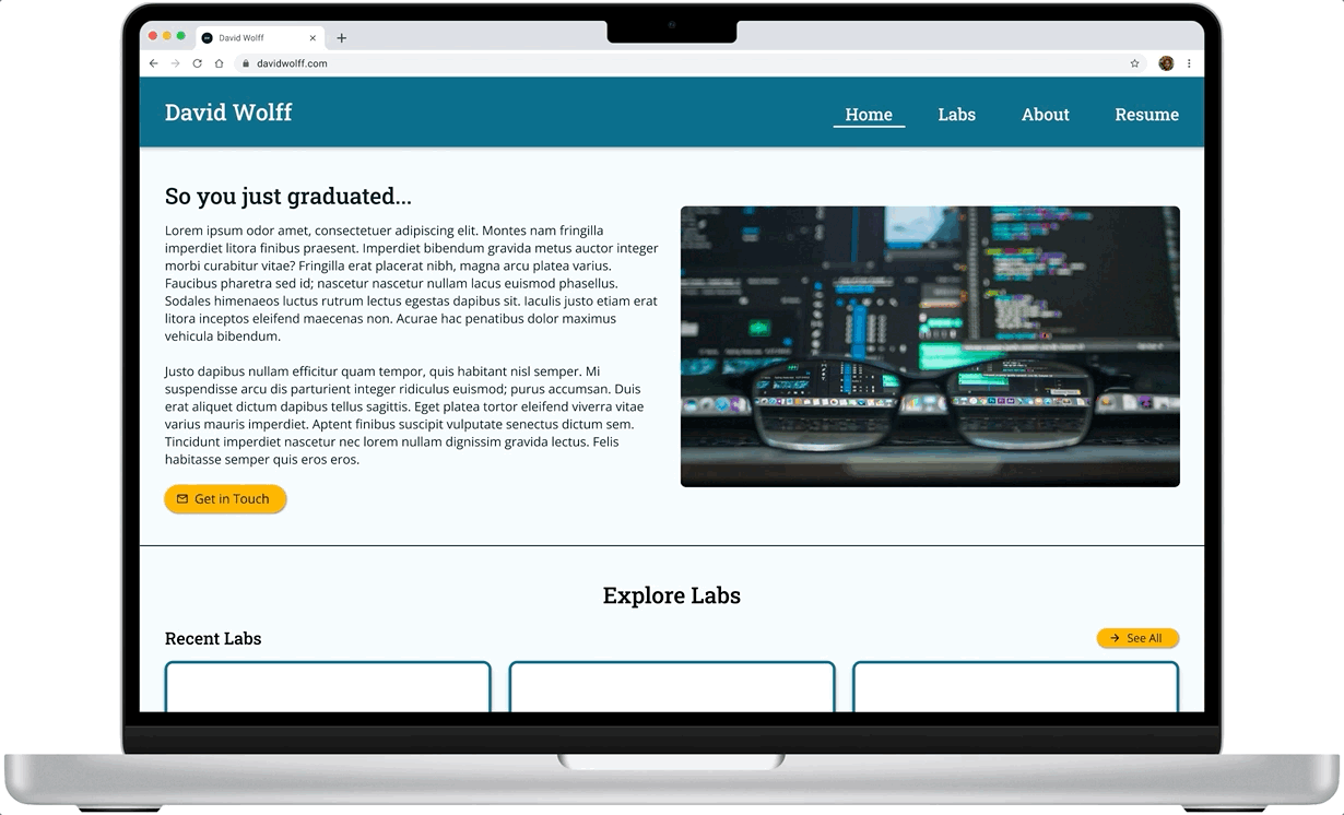
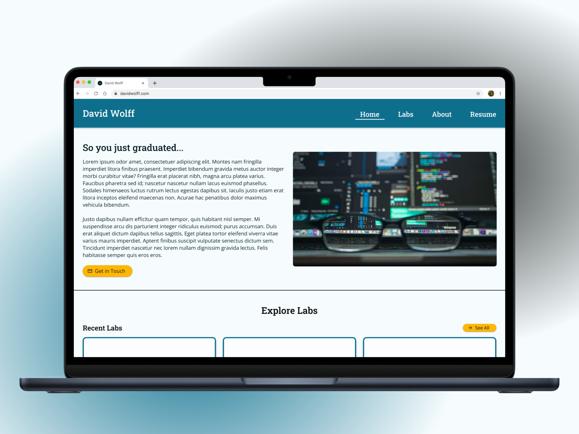
The Home page now highlights lab categories (React, JavaScript, CSS) to help users quickly find the type of coding practice they’re most interested in.
Simplified navigation with a clean, approachable layout to guide users to key actions.
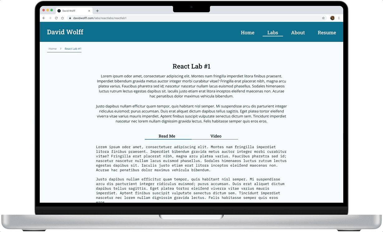
On the individual lab pages, users can quickly toggle between the README or the video format, depending on their learning style.
Focused content areas maintain momentum by only presenting essential information, reducing cognitive load and supporting faster user decision-making.
Consistent, intuitive CTAs so users always know the next step, whether browsing labs or getting in touch.
Branding and Visual Design
Alongside the structural refinement, I also developed a friendly, professional visual identity that aligned with David’s experience as both a mentor and a full-stack engineer.
Typography
Clean, modern typefaces that balance friendliness with technical credibility.

Color Palette
A vibrant mix of cool blues and warm yellows/oranges, creating a balance between trust, energy, and approachability — designed to motivate users without feeling overwhelming.

Microinteractions
Hover states and small animations were incorporated to create a more responsive and intuitive user experience, with additional animations planned for future iterations to further enhance engagement.


These branding choices were made to reinforce trust, confidence, and approachability — critical emotional triggers for new developers just starting their learning journey.
Outcome
In just one week, I went from initial concept to a polished, developer-focused prototype ready for build-out.
The final (for now) design:
Creates clear, inviting pathways for students to explore labs and start practicing coding without friction.
Reflects David’s professionalism and passion for education, mentorship, and community-building through a trustworthy and energetic visual identity.
Builds scalability into the structure, allowing for easy addition of new labs, categories, blog content, and community resources over time.
Ultimately, the platform positions David not just as a technical expert, but as a welcoming guide for new developers — making it easier for students to build confidence and continue learning.
Reflections
What Went Well:
Rapid discovery with David allowed for fast decision-making and a clear, unified vision throughout the sprint.
Prioritizing UX best practices over "perfect visuals" in the early phases helped me create an intuitive structure that served real user needs even without formal research.
Strategic flexibility — balancing short-term delivery goals with a long-term vision for future scalability — kept the design both achievable and expandable.
What I Would Improve Next Time:
Incorporate early usability feedback. Even short click-through tests or informal user observations could have helped validate navigation clarity and lab discoverability earlier in the design process, reducing the need for assumptions.
Deeper alignment on content strategy up front. Spending more time defining how labs would be named, categorized, and described could have streamlined the user experience and better supported future content scalability.
Additional microinteractions. While hover states were included, bringing more subtle microinteractions (like soft animations or transitional effects) into the earlier stages would have added polish and engagement from the start.
This project was a great reminder that clear structure and a strong understanding of your user's emotional journey are just as important as the visual polish.
Next Steps
With a strong foundation in place, the focus now shifts to building, validating, and evolving the platform based on real user feedback. The goal is to ensure the site not only launches successfully but continues to grow into a trusted, motivating resource for new developers.
To support that vision, I outlined a clear set of next steps to guide the platform’s evolution:
Launch MVP version of the site to start providing value immediately.
Extend the platform to mobile devices by designing responsive layouts and testing core flows on smaller screens to ensure accessibility and usability across devices.
Conduct usability testing with real coding students to gather insights on navigation, content clarity, and overall experience.
Iterate based on feedback to further optimize the platform for learning and exploration.
This project reinforced the importance of designing not just for clarity, but for user confidence — especially for audiences stepping into complex new skills like coding. Working under tight time constraints pushed me to prioritize strategic structure, clear communication, and future scalability at every stage. It was a valuable exercise in balancing immediate needs with long-term vision.