

Responsive web app for curated city exploration.
My Role
UX Researcher, UI/UX Designer, UX Strategist
Tools
Figma, Adobe XD, FigJam, Google Forms, Miro, Maze, Zoom
Time
~2 months
Background
Explore Chicago is a responsive web app that helps users discover Chicago’s best experiences — from restaurants & bars to parks & museums. Designed for both locals and those who are new to Chicago, the platform addresses the overwhelming nature of urban exploration by offering curated, easy-to-browse recommendations.
The Problem
Exploring a large city like Chicago can feel overwhelming. People are often faced with endless, unorganized lists of places without enough curated guidance. Many discovery apps leave users frustrated, wasting time trying to find experiences that actually match their interests or location.
The Goal
Design a mobile-first, responsive platform that makes city exploration intuitive and stress-free. Explore Chicago empowers users to quickly discover experiences based on their mood, preferred neighborhoods, and proximity — simplifying decision-making and encouraging authentic local exploration.
Constraints & Requirements
The platform needed to be fully responsive, providing an optimized experience across mobile, tablet, and desktop devices.
The design had to prioritize a mobile-first approach, as users were most likely to explore while already on the go.
Minimal onboarding friction — users needed to start exploring immediately without being forced to create an account first.
The interface had to feel intuitive and approachable, making it easy for first-time visitors to browse.
User Research
In order to better understand the users I was designing for and what their needs were, I conducted multiple user interviews. The primary user group I identified were individuals aged 18-42, who live in a major city, and go out at least every 2 weeks.
Through user surveys and interviews, I discovered that many people felt frustrated about a lack of resources for finding new places to explore. Additionally, users wanted more information about these places, such as more photos, a map feature, and complete information surrounding pricing and parking.
To synthesize user feedback and better understand users' behaviors, emotions, and needs, I created two aggregate empathy maps. These maps helped reveal not just what users said, but also what they thought, felt, and struggled with during the exploration process.
Lauren
New to Chicago, 27-34, North Side
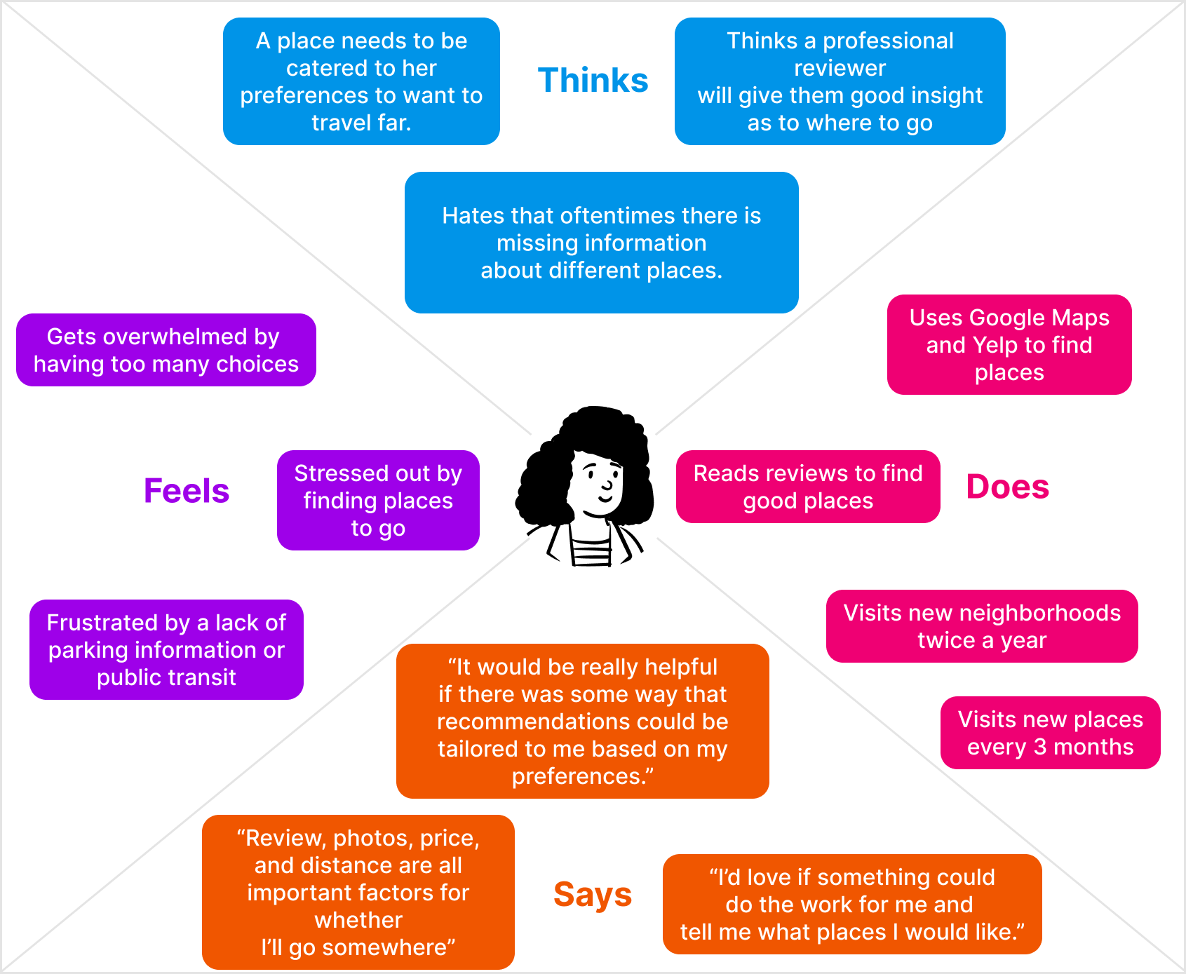
Stephen
Born and raised, 35-32, West Side

These empathy maps highlighted several recurring patterns and frustrations, leading to the identification of three key pain points to address in the design:
Pain Point #1
Users struggled with a lack of visual representations of where places were located.
Pain Point #2
Users were frustrated by having to click open different place listings to get more info.
Pain Point #3
Users struggled with cognitive overload, constantly feeling overwhelmed by too many options.
To better align the design with the needs of our users, I created two primary user personas based on the themes uncovered during research. These personas provided a focused lens for design decisions, ensuring features like visual discovery, quick access to critical information, and reduced cognitive overload were prioritized.


To further connect the personas to actionable design goals, I developed user stories representing core needs and tasks. These user stories helped prioritize features and ensured that the final experience solved real user problems.

“As a busy, new Chicagoan, I want to have access to reliable information about different places so that I can find places I really love going to.”

“As a bartender and bar lover, I want to explore new places so that I can experience the best of what Chicago has to offer.”
After establishing user stories, I mapped out each persona's discovery journey to visualize emotions, frustrations, and opportunities at each step.
Lauren’s User Journey Map

Stephen’s User Journey Map

Based on all of the user research, empathy mapping, and journey mapping, I crafted two primary problem statements to guide the design strategy.
Lauren’s Problem Statement:
Lauren is a homebody who recently moved to Chicago and needs to find places she enjoys, because searching for new spots currently causes her stress.
Stephen’s Problem Statement:
Stephen is an outgoing explorer who wants to discover more parts of the city to find underground bars with good vibes.
With a clear understanding of user needs, behaviors, and key problems, I turned to analyzing the competitive landscape to identify opportunities for differentiation.
Competitive Audit
To better understand the current landscape of city exploration platforms, I conducted a competitive audit of three major competitors: Choose Chicago, Do312, and Google Maps. The goal was to identify common patterns, strengths, weaknesses, and key gaps that could inform opportunities for Explore Chicago.
Audit Goals:
Evaluate key features offered by competitors.
Identify gaps and areas of opportunity for differentiation.
Understand how competitors position themselves in the market and communicate with users.
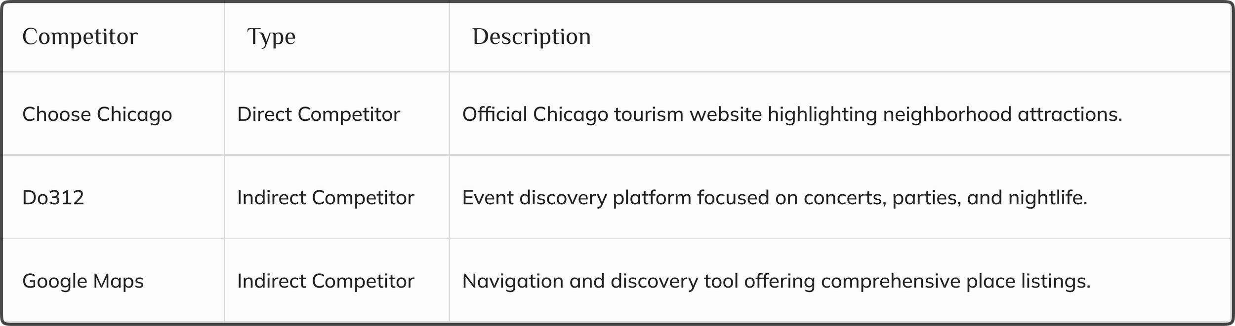
Key Competitors:
Strengths and Weaknesses
Choose Chicago offers a simple, easy-to-navigate website that provides curated recommendations for different neighborhoods. Its limited number of options helps avoid overwhelming users. However, the site lacks depth — there is no ability to save favorite places, parking information is missing, and many places are not included, limiting its usefulness for regular explorers.
Do312 is a strong resource for finding last-minute events, appealing especially to users looking for same-day plans. However, the platform has slightly cluttered branding, a lack of effective search or filter options, and no map view. Important event details like pricing and location are often buried, making it harder for users to make quick decisions.
Google Maps excels at providing comprehensive information and robust filtering tools, allowing users to easily find and navigate to a wide range of locations. Its trusted brand identity further strengthens user confidence. However, users are often overwhelmed by too many options, and the platform offers little personalization. Exploring places by neighborhood or vibe is tedious, limiting its usefulness for casual discovery.
Across all competitors, a lack of personalized discovery and overwhelming or incomplete information emerged as consistent user pain points — opening a clear opportunity for Explore Chicago to stand out.
Gaps in the Market
Despite offering useful features in isolation, none of the competitors fully addressed key user needs around intuitive exploration.
Key gaps identified include:
Lack of personalization across all platforms — users receive the same recommendations regardless of their interests or mood.
Overwhelming information overload, particularly on Google Maps and Do312, without strong filtering options.
Limited browsing by neighborhood, making exploration tedious and time-consuming.
No option to save or favorite places for easy return visits (especially on Choose Chicago and Do312).
These gaps created an opportunity for a solution that could combine the best of all platforms while addressing their shortcomings.
Opportunities for Explore Chicago
Explore Chicago was designed to directly fill these gaps by offering:
Personalized recommendations based on user mood, preferences, and location.
Streamlined discovery flows that reduce cognitive overload by surfacing curated, relevant suggestions.
Neighborhood-based browsing to match how users naturally think about exploring.
Important information up front, including pricing, photos, and parking info.
Favorite functionality, allowing users to build their own personalized collections over time.
With a clear understanding of user needs, competitive gaps, and strategic opportunities, I moved into the design process — focusing on creating an intuitive, visual-first discovery experience that directly addressed user frustrations.
Design Process
The design process for Explore Chicago started with rapid ideation and early exploration. I focused on building a simple, engaging experience that would allow users to quickly find places matching their mood and location, without feeling overwhelmed.
Through sketches, low-fidelity wireframes, and multiple rounds of iteration, I worked to prioritize clarity, ease of use, and a strong visual navigation system.
Early Ideation and Sketches
Before diving into wireframes, I began with rapid ideation exercises to generate a wide range of possible exploration models.

Using the Crazy 8s method, I sketched multiple concepts for how users could browse places — focusing on map-first interactions, mood-based filters, trending neighborhood highlights, and quick visual discovery.
Early sketches explored ideas like:
A "What's Your Mood?" landing experience to immediately personalize suggestions.
Visual cards for neighborhoods and experiences.
Map-based browsing with location pins filtered by vibe or category.
This early ideation phase helped me quickly explore diverse approaches and prioritize features that aligned most closely with user needs: visual navigation, simplified decision-making, and fast access to relevant places.
Information Architecture
After exploring early concepts through sketching, I developed a focused information architecture to organize content and simplify navigation across the platform. The structure prioritized quick discovery through the three main pillars of the app: Explore, Search, and Account.
Explore offers mood-based and neighborhood-based browsing, surfacing curated suggestions like bars, restaurants, museums, parks, and shops.
Search allows users to filter places based on price, vibe, distance, reviews, and type — supporting users who have specific goals in mind.
Account enables users to save favorite places, view visited spots, and manage basic settings.
Additionally, core flows like logging in, creating an account, or contacting support were kept easily accessible but secondary to the discovery experience. This information architecture was intentionally designed to reduce cognitive overload, helping users quickly browse or search without feeling overwhelmed by too many options at once.

Paper Wireframes
With the information architecture in place, I moved into translating my early sketches into more structured paper wireframes. This step allowed me to quickly iterate on layout ideas for key screens.

Paper wireframing enabled rapid ideation and adjustment based on usability principles before investing time into higher-fidelity digital layouts.
Low-Fidelity Wireframes
Building on the paper wireframes and information architecture, I created low-fidelity digital wireframes in Adobe XD to define the core layout and browsing flow. At this early stage, the focus was on enabling users to visually explore Chicago neighborhoods and discover featured places without overwhelming them.
Key design priorities included:
Neighborhood Discovery: Highlighting trending neighborhoods and allowing users to browse experiences within each area.
Visual Place Cards: Presenting places with simple, visual cards featuring names, categories, and minimal navigation friction.
Streamlined Navigation: Establishing the primary Explore and Account flows, while Search and advanced filtering were deferred for future iterations.
By keeping the wireframes deliberately minimal and navigation-focused, I aimed to test the foundation of the browsing experience before layering in more complex features.
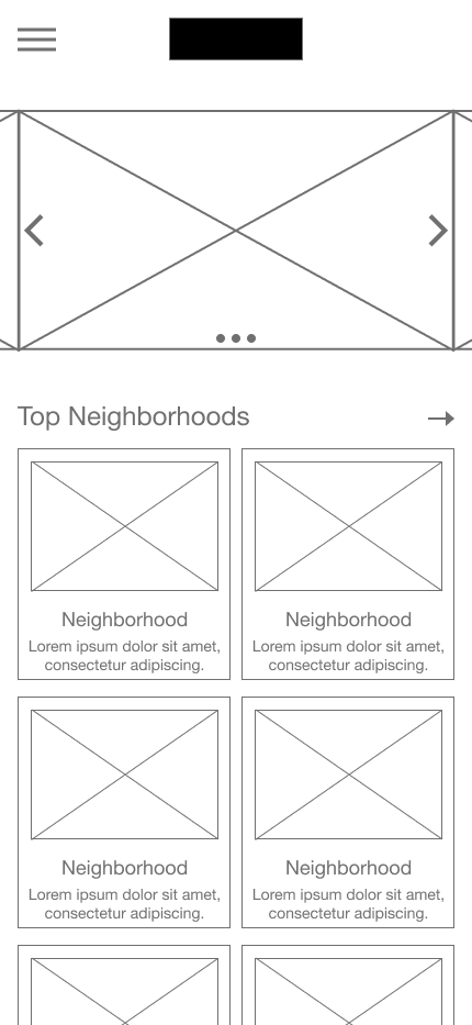
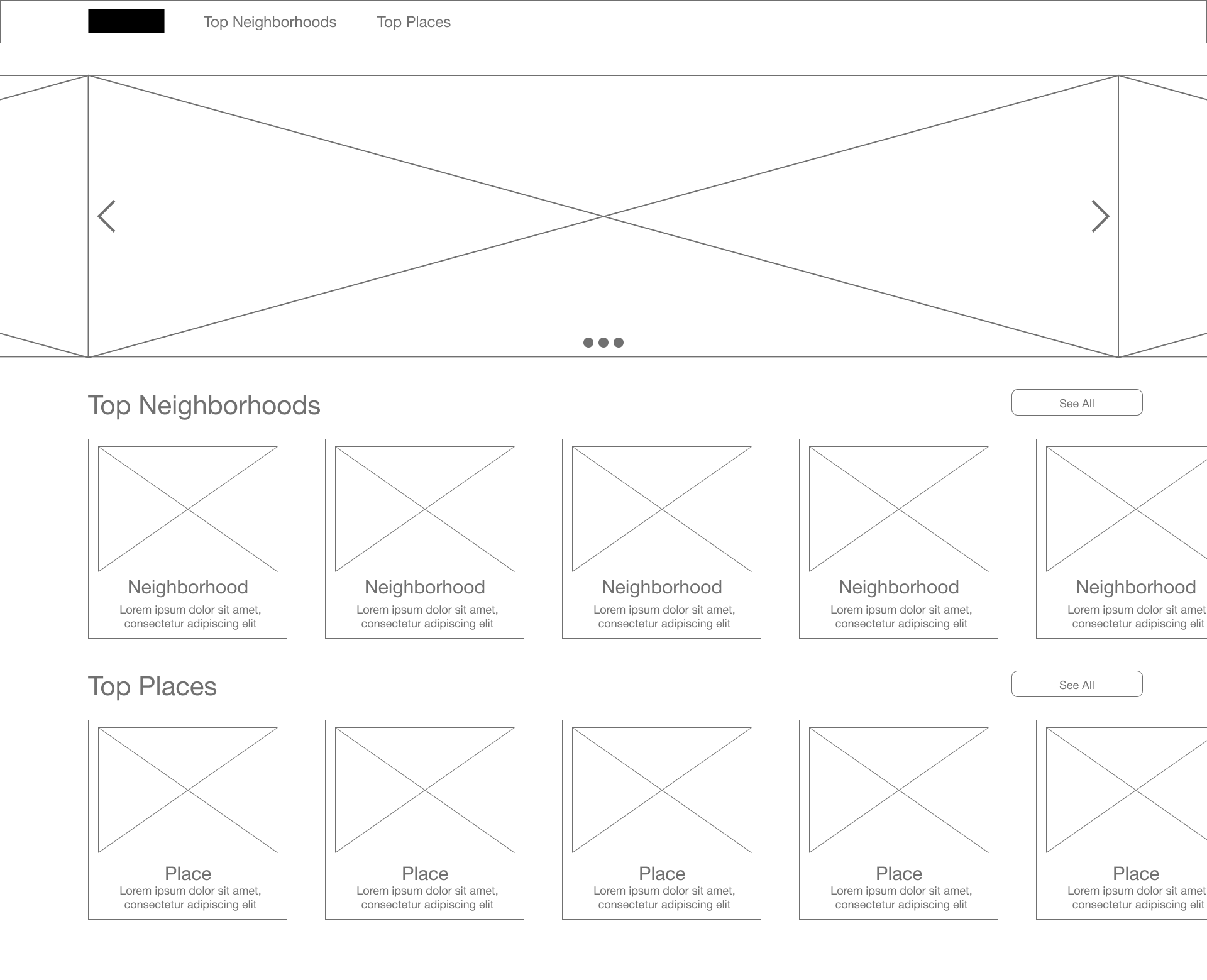
The homepage prioritizes simple entry points into neighborhood browsing. Featured neighborhoods are visually highlighted to encourage exploration, and users can quickly tap into an area of interest.

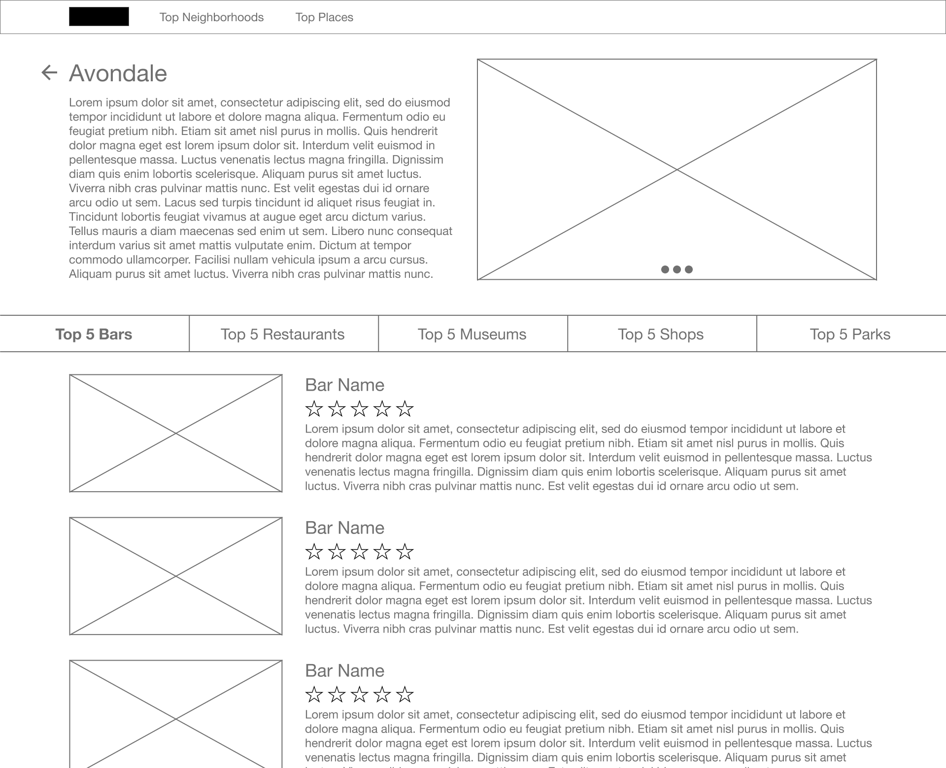
The individual neighborhood page offers a clear, scannable view of all available options within a specific neighborhood. Each neighborhood card presents a recognizable photo and name, and options of places to go sorted by category so that users can make quick, confident choices about where to explore next.
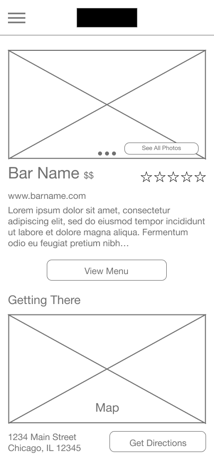
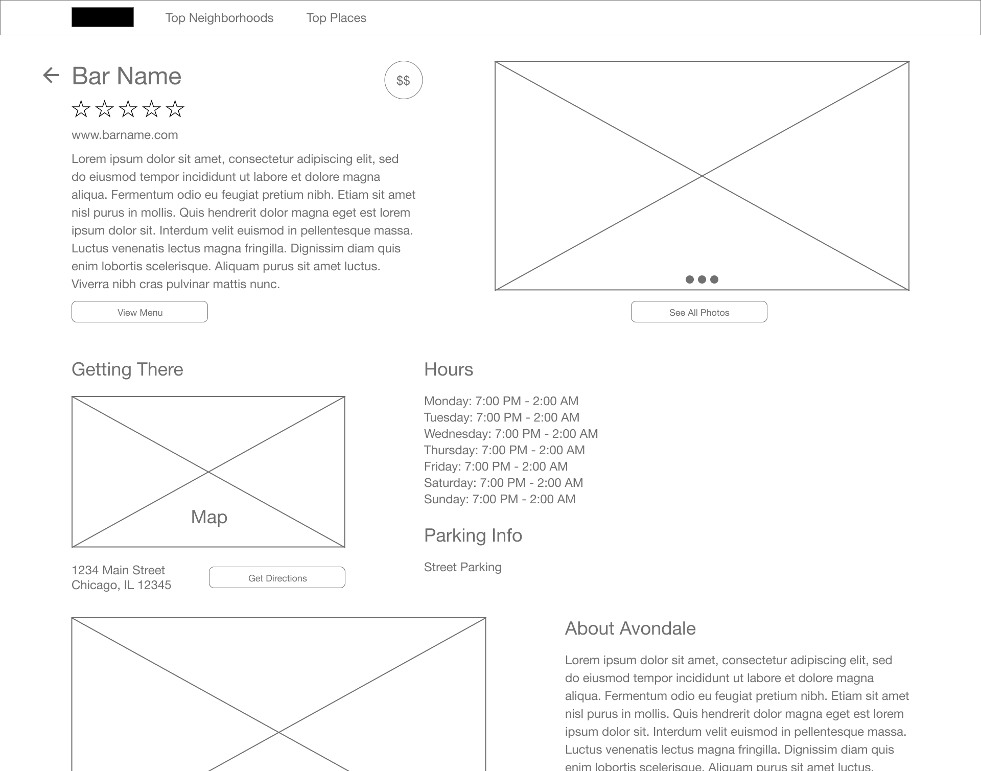
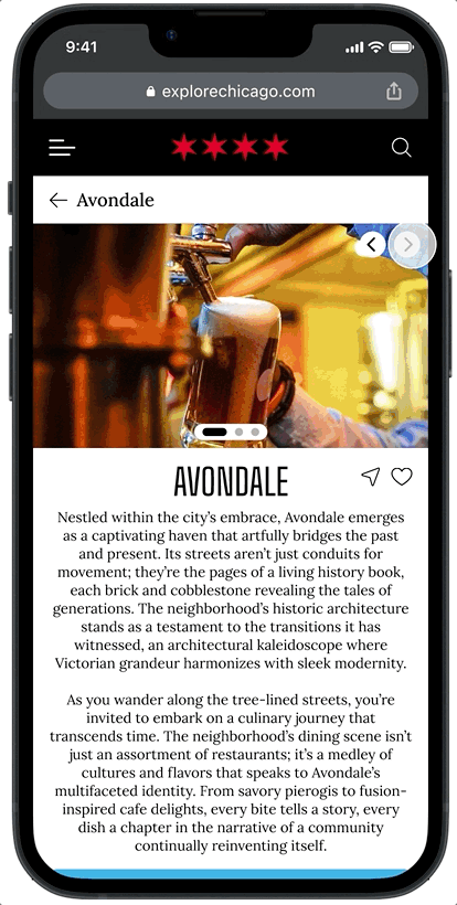
On the place detail page, users can quickly access important information like address and hours, with quick access to essential links. The layout focuses on clarity and simplicity, ensuring users can decide at a glance whether a place matches their interests.
With the low-fidelity wireframes complete, I conducted a first round of usability testing to validate core user flows, uncover pain points, and gather early feedback before moving into high-fidelity design.
First Round of Usability Testing - Lofi Prototype
Even though it was early, I was excited to finally get the wireframes in front of users. I knew getting real feedback before moving forward would be crucial.
Testing Methodology:
5 participants, unmoderated remote usability study (Chicago-based users aged 18–42).
Focused on evaluating the primary user flow: exploring the homepage, selecting a neighborhood, and finding a place within that neighborhood.
Research goals included assessing ease of navigation, identifying missing features, and uncovering major usability pain points.
KPIs observed: time on task, task completion success, user error rates, and overall user sentiment.
Key Findings:
Users were frustrated that places weren’t sorted into more specific categories like bars, restaurants, and museums, making browsing feel overwhelming.
Participants felt hesitant to choose a neighborhood without seeing more initial information about what it offered.
Users preferred a more visually driven experience, wanting larger, more prominent photos to help guide their decision-making.

“I don’t really want to guess what’s in a neighborhood — I need to see more before I’d pick one.”
It was reassuring to see clear patterns in the feedback — users weren't asking for wildly different things; they just needed better organization, clearer cues, and more visual focus. I was excited to start applying these improvements in the next design phase.
High-Fidelity Prototyping and Design Iterations
After completing low-fidelity testing and gathering user insights, I moved into high-fidelity prototyping to refine the user experience and visual design of Explore Chicago. At this stage, I focused on applying the feedback from usability testing — improving navigation clarity, enhancing visual discovery, and addressing gaps users identified in the early wireframes. I initially created the high-fidelity designs in Adobe XD, and once the major UI components were established, I transitioned the project into Figma to streamline prototyping, collaboration, and iterative testing.
It was exciting to see the project start to feel real. I kept user needs top of mind with every design decision, aiming to make the experience feel as effortless and engaging as possible.
Key improvements based on usability insights:
Introduced category filters (bars, restaurants, museums, etc.) to streamline browsing and reduce cognitive overload.
Added more initial information about neighborhoods to build user confidence before committing to a choice.
Elevated photos as the main way users scanned and evaluated places, supporting faster, more intuitive decision-making.
Mobile and Tablet Experience
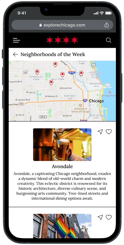
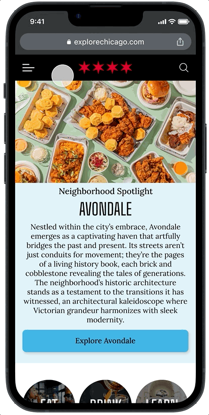
The mobile homepage prioritized simple entry points to exploration. Featured neighborhoods were immediately visible, and thumb-friendly navigation allowed users to start browsing quickly. Short descriptions of what can be found in each neighborhood were also included on each card.
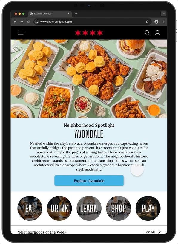
On tablet, slightly larger grid layouts were introduced to take advantage of additional screen space without losing mobile-first simplicity.
The list of neighborhoods now includes more detailed descriptions.
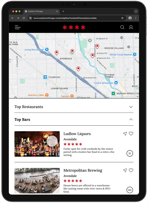
A map view was also added so that users know where each neighborhood is located.
Places within neighborhoods were categorized by type and displayed using large, tappable cards within collapsible sections, allowing for fast visual scanning.

Users can quickly find what they’re looking for and make a decision.

Place detail pages focused on showcasing imagery and essential information up front (address, hours, parking info) to enable fast decision-making.
Additional options were added at the bottom of the screen for nearby and similar places.
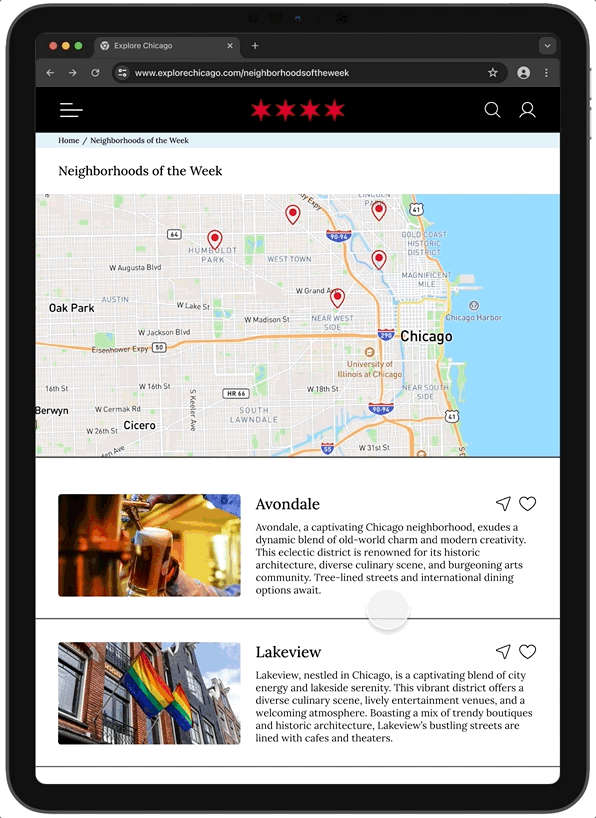
Desktop Experience
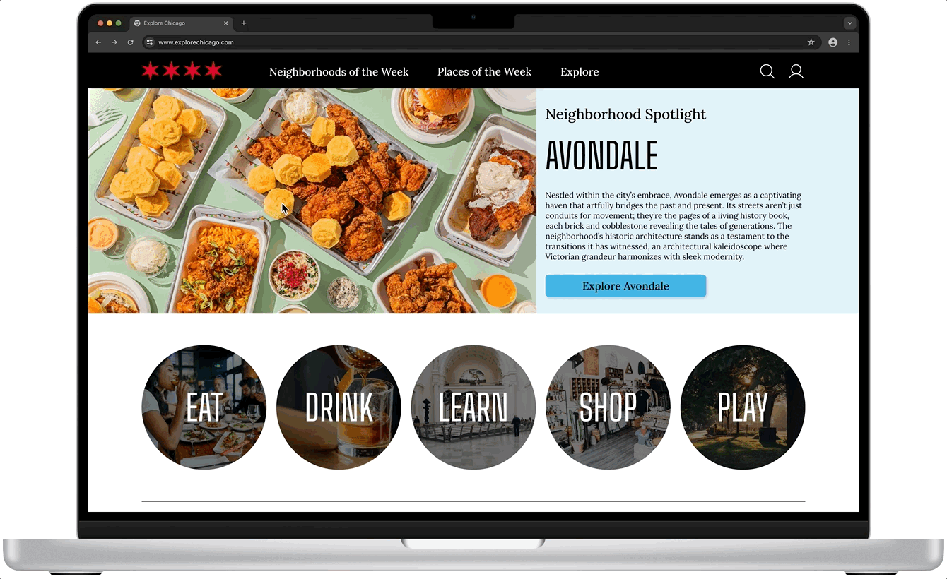
On desktop, the layout expanded to a wider grid of featured neighborhoods and places, maintaining visual clarity without overwhelming users. The focus remained on quick exploration pathways rather than long, text-heavy descriptions.

The desktop design retained the tab-based navigation system introduced during the low-fidelity phase, allowing users to easily switch between viewing bars, restaurants, museums, shops, or parks.
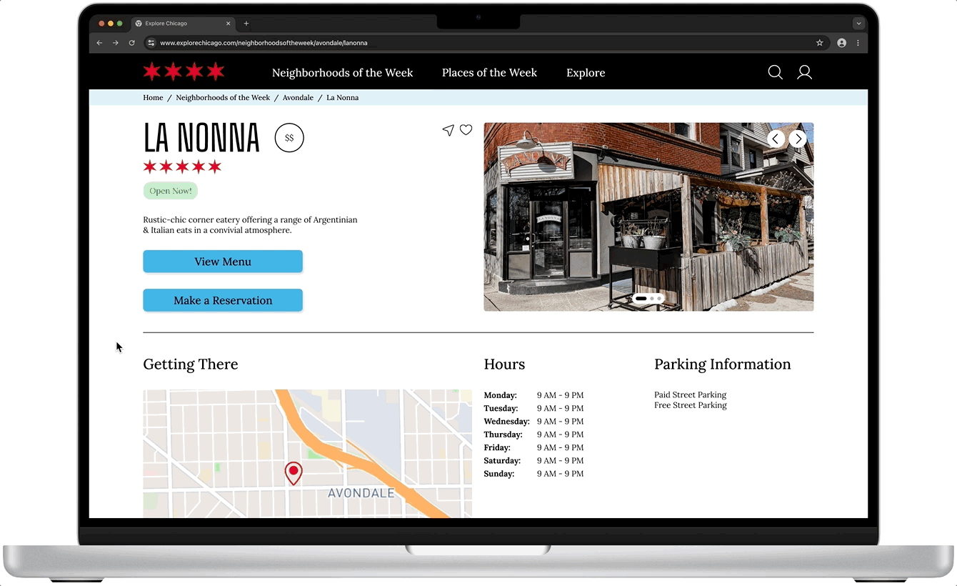
Place detail pages offered slightly more informational depth on desktop, including larger maps and photos, while keeping the main actions (View Menu, Get Directions) highly visible.
After completing the core pages for Explore Chicago, I turned my attention to a new feature designed to support even more intuitive discovery: the interactive map.
Second Round of Usability Testing – Full Flow & Interactive Map
With the core browsing experience refined, I introduced a major new feature: interactive map exploration. The map was designed to give users a more visual, intuitive way to discover neighborhoods across Chicago — reducing reliance on scrolling and making exploration feel faster, easier, and more engaging. Before finalizing the design, I conducted a second round of usability testing focused on the overall user flow as well as specific impressions of the new map feature.
Testing Methodology:
5 participants, unmoderated remote usability study (Chicago-based users aged 18–42).
Focused on evaluating the primary user flow: exploring the homepage, selecting a neighborhood, finding a place within that neighborhood, and navigating via the new Map feature.
Research goals included assessing ease of navigation, identifying missing features, and validating whether the Map made exploration easier and more enjoyable.
KPIs observed: time on task, task completion success, user error rates, and overall user sentiment.
The interactive Map feature allowed users to view a map of Chicago neighborhoods that are outlined with different color blocks. Users could then click on one of the neighborhoods to see further information. The goal was to make exploration feel playful, spatial, and visually intuitive across all devices. While this round of testing evaluated the full browsing experience, the Map feature was newly introduced at this stage.
Responsive Map Screens:

Key Findings:
Participants found the homepage and neighborhood browsing intuitive, with clear visual entry points that supported fast decision-making.
Users described the interactive Map feature as "helpful” and "easy to use" once they began exploring it.
Users appreciated the visual nature of the map experience, saying it made exploration feel "playful" and "less stressful" compared to scrolling through lists.
Users expressed interest in expanded map functionality, such as being able to browse and select individual places directly through the map interface, not just neighborhoods.
Overall, the second round of usability testing confirmed that the Explore Chicago experience was intuitive, visually engaging, and easy to navigate. The introduction of the interactive Map feature was well received, with users describing it as a fun and helpful way to explore the city. However, feedback also revealed opportunities to expand the map’s functionality in future iterations — such as enabling users to browse and select individual places directly from the map as well as being able to filter results. These enhancements are planned for future development to make the map an even more powerful discovery tool.
Third Round of Usability Testing – Final Validation
To finalize the project, I conducted a third and final round of usability testing focused on overall impressions of the Chicago Explorer platform. This round aimed to validate whether the site felt complete, usable, and engaging across browsing flows and map exploration — and to uncover any final opportunities for refinement before moving into next steps.
Testing Methodology:
5 participants, unmoderated remote usability study (Chicago-based users aged 18–42).
Focused on gathering overall impressions of the Chicago Explorer site.
Research goals included validating ease of use, visual appeal, overall satisfaction, and identifying any final opportunities for refinement before future development.
KPIs observed: overall user sentiment, ease of navigation, feature engagement, and likelihood to recommend.
Key Findings:
Participants described the site as clean, easy to navigate, and visually inviting.
Users found the homepage intuitive, but one participant suggested offering more upfront highlights for neighborhoods to make browsing even faster.
The tab-based category filters on neighborhood pages (bars, restaurants, museums, etc.) were well received and helped users find what they were interested in quickly.
The interactive Map feature was seen as helpful and enjoyable, though several participants wished it allowed browsing and selecting individual places, not just neighborhoods.
Some users expressed interest in a list feature to save places they wanted to visit later.
4 out of 5 participants said they would recommend the site to friends visiting Chicago or use it themselves for planning outings.

“I love the map, but it would be even better if I could just tap around and find places too — not just neighborhoods.”
Overall, the third round of usability testing confirmed that Chicago Explorer was intuitive, visually engaging, and ready for next steps — with future enhancements like expanded map interactivity and list/account features planned to continue improving the user experience.
Final Outcomes and Reflection
Through three rounds of research, design, and usability testing, I built and refined Explore Chicago into a clean, intuitive, and visually engaging responsive web app that helps users discover new neighborhoods, places, and experiences across the city.
The final design successfully addressed users’ core needs:
Reducing cognitive overload by introducing curated selections and photo-driven browsing.
Supporting intuitive discovery with an interactive Map feature that users found fun and helpful.
Creating a seamless flow from homepage exploration to neighborhood and place selection.
Across multiple testing rounds, participants consistently described the platform as "easy to use," "fun to explore," and "something I’d actually use" — validating that the design aligned closely with real user behavior and goals.
At the same time, usability feedback uncovered future opportunities for growth:
Expanding the Map feature to allow direct browsing of individual places, not just neighborhoods.
Adding list and account features so users can keep track of favorite spots.
Continuing to enhance the discoverability of key features across different device types.
Working on Explore Chicago helped me deepen my ability to translate research insights into clear design priorities, advocate for iterative improvements, and balance visual design choices with real user needs. It reinforced my belief that great user experiences aren’t built all at once — they emerge through thoughtful, user-driven iteration. I’m excited to continue developing Explore Chicago based on user feedback — and even more excited to bring the same energy and focus to future projects where user needs come first.
Next Steps
While the core user experience of Explore Chicago has been validated, future updates are planned to further enhance discovery and personalization, including:
Expanding the Map feature to allow users to browse and select individual places directly from the map view.
Implementing a list feature so users can create personalized lists of favorite neighborhoods and places.
Continuing to optimize onboarding and microinteractions, especially around new features, to reduce first-time user confusion.
Gathering additional feedback post-launch to guide future iterations based on real-world usage patterns.
Designing Explore Chicago was a reminder that great user experiences are never finished — they're continually shaped by listening, testing, and iterating. I’m proud of how this project grew through user feedback, and I’m excited to keep creating thoughtful, intuitive designs that help real people explore, connect, and discover in new ways.